Moving home

Built on: Figma
Moving home is stressful.
Moving home is a stressful process which comes with so many tasks for people to carry out. The last thing people want to do is worry about their energy account and supply. Making this journey seamless and understandable was a priority.
The task
A look into the experience of existing customers moving house while staying on supply with Shell Energy.
Problem Areas
Treating existing customers as new customers
Within the journey of moving out, if an existing customer chooses to carry energy/gas supply from Shell Energy with them to their new property, they get treated as a new energy customer/submission. Functionally, this is how the back-end handled this process.
Re-entering personal details
Due to the back-end treating the user as a new energy submission, the front end did too, and required them to re-enter all details such as; personal details, address details/ history, payment details and marketing preferences.
This provided a jarring journey which was far too taxing for the user, rather than creating a new experience tailored to the users' needs. This way of retrieving customer data simply provided extra clicks and potentially a lack of trust from a user.
The result
Time-on-task reduced by 90%
The proposed solution managed to reduce the time-on-task by over 90%! Previously, it would take users 4 minutes to complete this task, now, it takes around 20 seconds!
25 clicks down to 1
We managed to achieve this improvement in the journey, while still maintaining all core functions! Reducing the number of clicks-to-value from 25 to 1. Also, reducing the number of screens from 6 down to 2.
How I did it
Looking at the journey as a whole
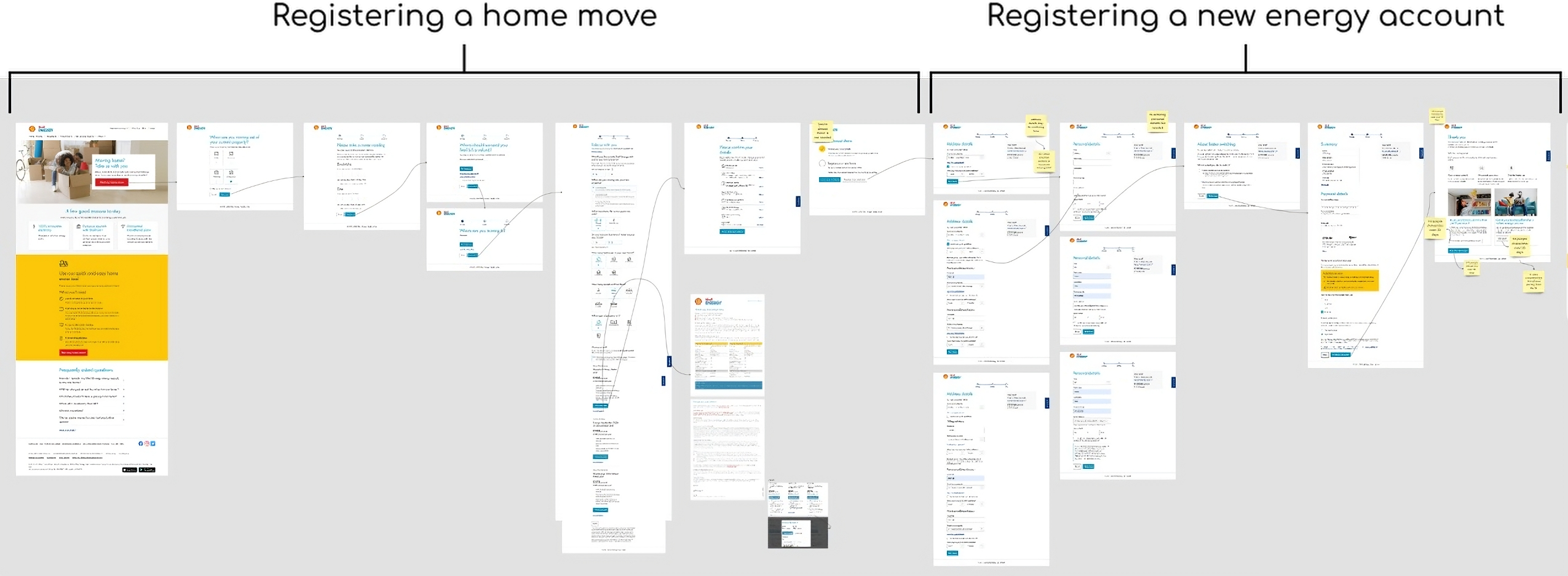
Initially working with product owners, developers and other members of the UX team; we mapped out the journey to brainstorm problem areas and necessary steps within the process.
This journey contained 2 functions: Registering a home move and registering a new energy account at a user's new property.
An existing customer registering a new energy account with Shell Energy was a poor experience, since they already had an account with us, this may cause anxiety surrounding their energy account, credit or debt.
Finding the solution
Iteration 1: Pre-populating the form fields
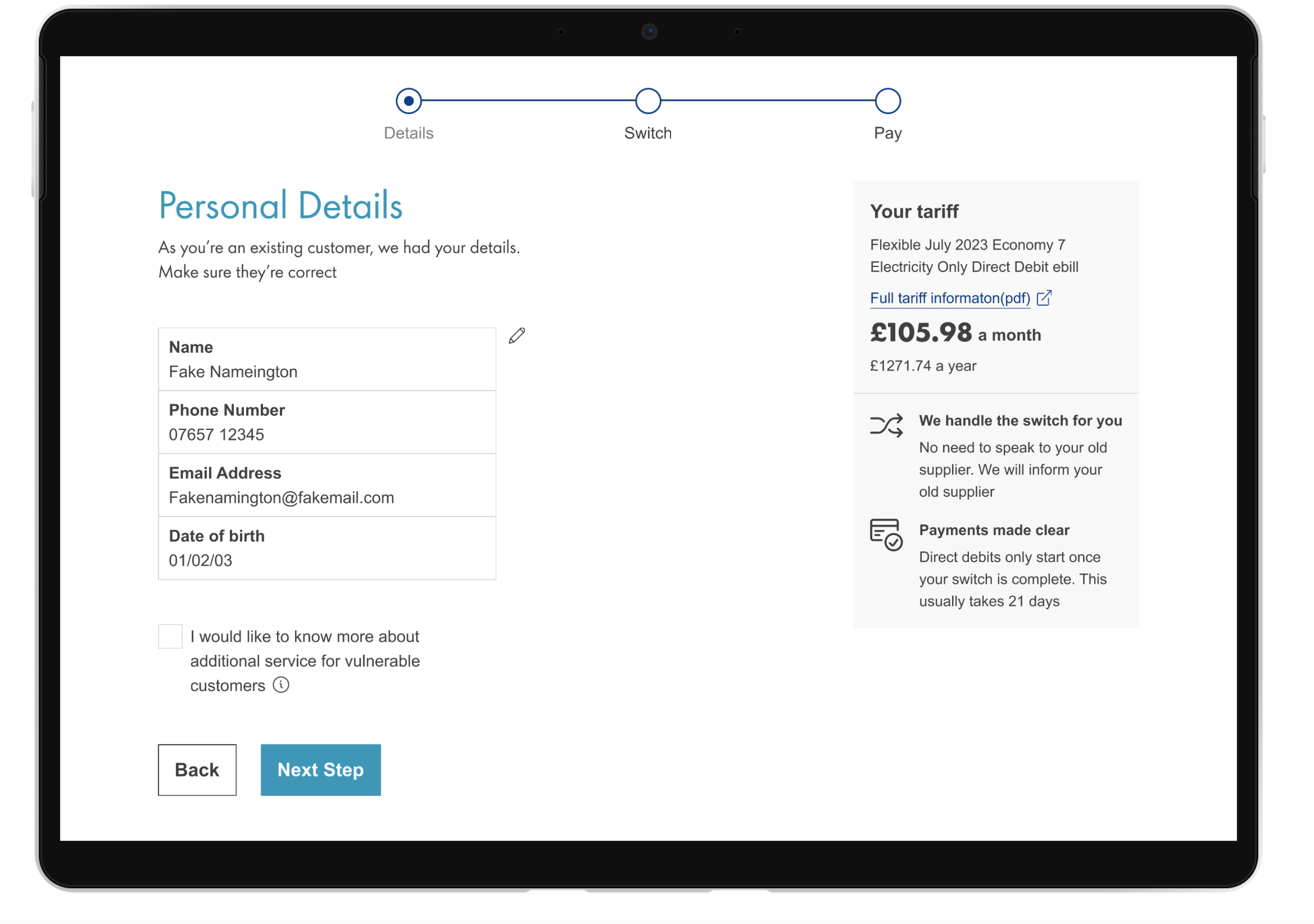
An initial solution was to pre-populate the form fields, while this solved the problem of treating existing customers as new customers, the issue remains in a poor UX - affirming their details on 4 separate pages; personal, address, switch date and payment, it provided a similarly long experience.
Iteration 2: Removing unnecessary screens
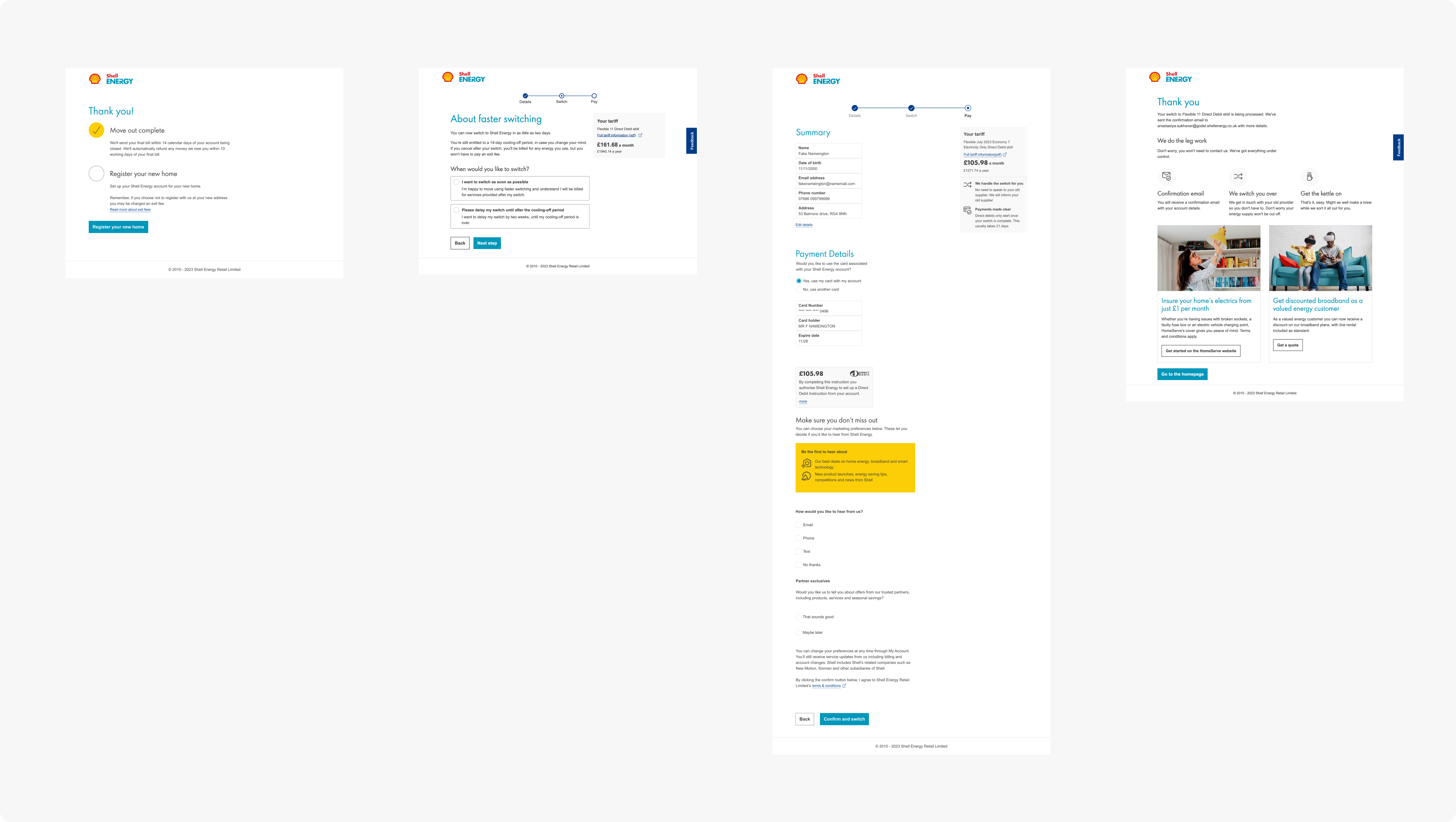
 19 Clicks saved & 2 screens removed
In this iteration we removed the need for the user to re-enter personal information by making an API request to their current account details to pull the data. Then pre-populating the form fields on a single summary screen.
Iteration 3: Removing more screens &
marketing preferences
 4 Clicks saved & 1 screen removed
In this iteration we paid attention to the context of the user journey, and provided copy on the summary screen referring to the previous function, to provide a more seamless experience.
We also removed the faster switching screen and asking the question at the bottom of the new summary screen, while pre-selecting the ‘faster switch’ option as 90% of users selected this.
Another feature removed was marketing preferences. This was done as to remove more features a user typically wouldn’t care about - they simply want to register their new home as quickly as possible and getting ready to move home, not worry about marketing preferences.
Iteration 4: A single screen
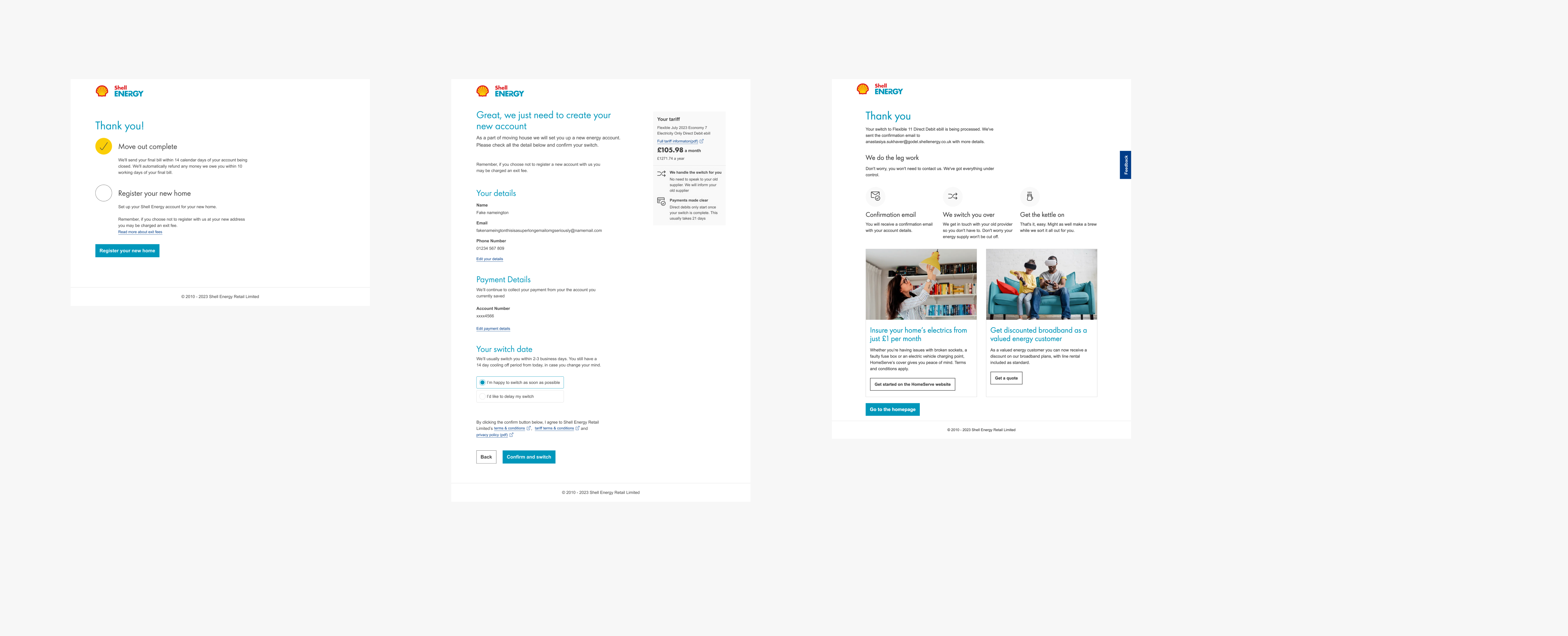
 2 Clicks saved & 1 screen removed
The thank you screen provided a back-end pass of the moving home data the user previously entered, as things like their tariff needed to be carried over. Although, it seemed to just provide an extra click and while it helped users better understand where they were going, this could be solved with copy on the summary screen.
Since we were using user data in this way, I also worked with the data privacy team to make sure everything was in check!
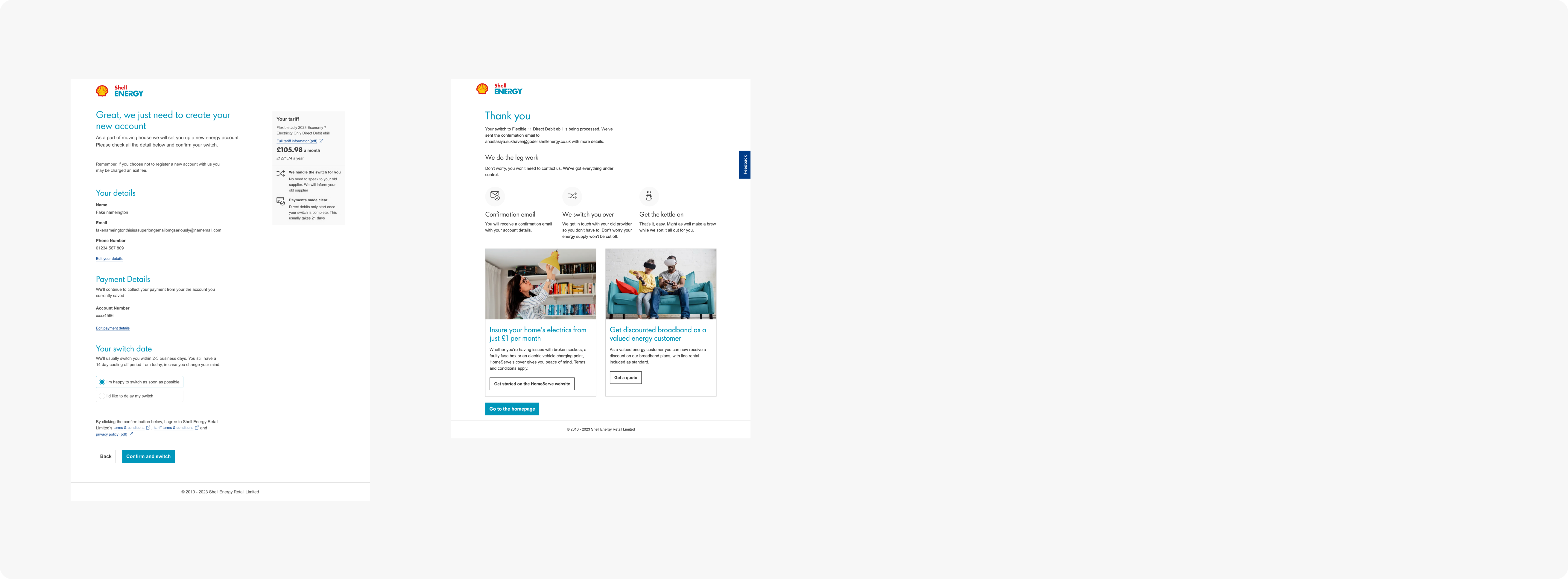
Refining the designs
Now the flow was significantly reduced providing a stronger UX, it was time to refine the UI designs.
The summary screen
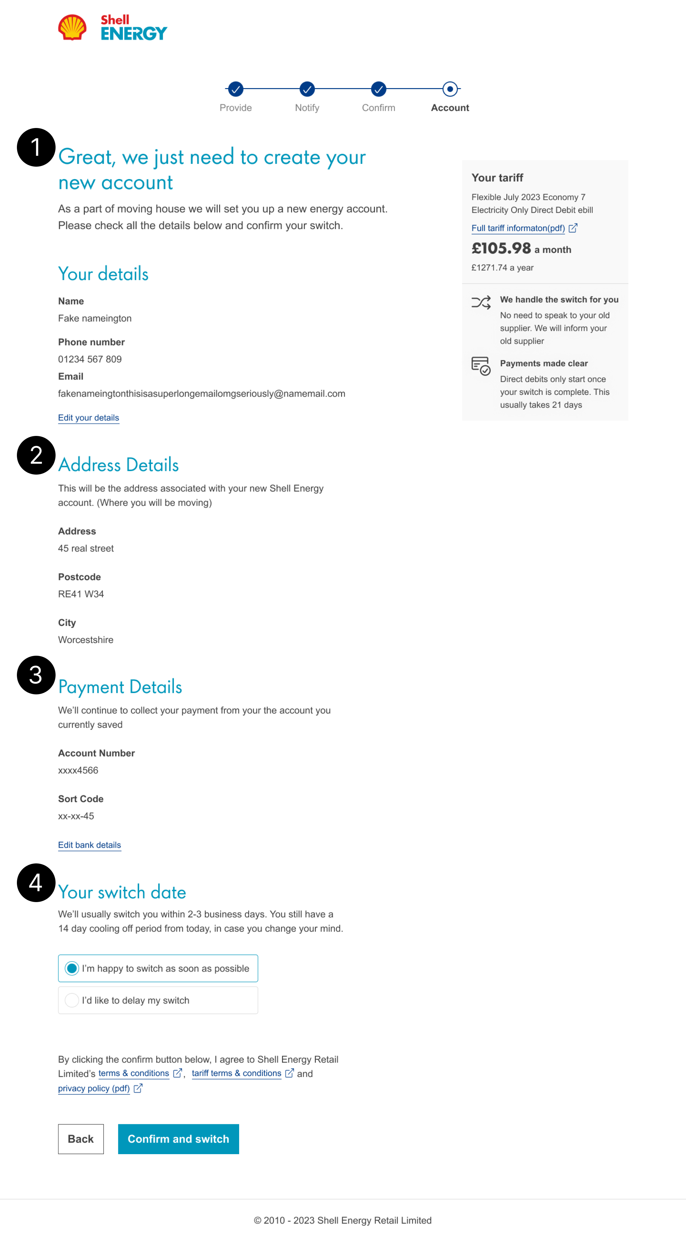
-
1. Lead text
Providing highest level copy acknowledging the journey the user had just completed.
-
2. Address details
Including address details as its own section to make it clear for a user which address should be used.
-
3. Payment details
Stating we’ll take payments as usual, since most users didn’t switch payment methods here. Also, giving users the choice to change payment method, as they’re moving house, they may need to start paying with a different account.
-
4. Switch date
Preselecting the top option, as 90% of users currently did this.
The thank you screen
My goal here was to make it feel like one whole bespoke experience rather than an off-the-shelf solution.
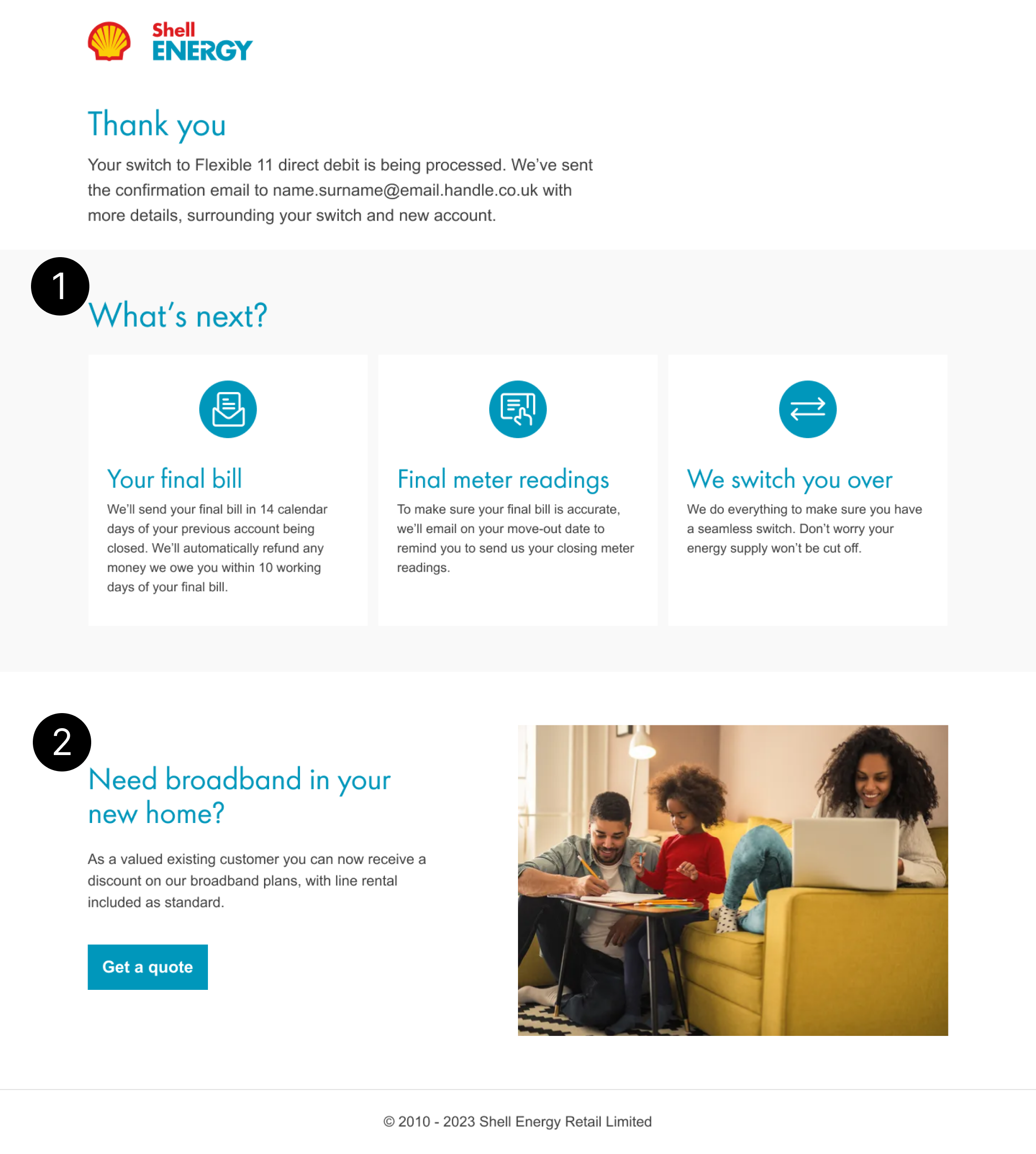
-
1. What’s next
Included the next 3 steps for a user in relation to moving home. The previous thank you screen just provided information surrounding setting up an account.
-
2. Broadband
Previous thank you page CTA had less than 1% of users click so changing the copy to make it come across as trying to help the user rather than upselling, to encourage more clicks.
Measuring Change
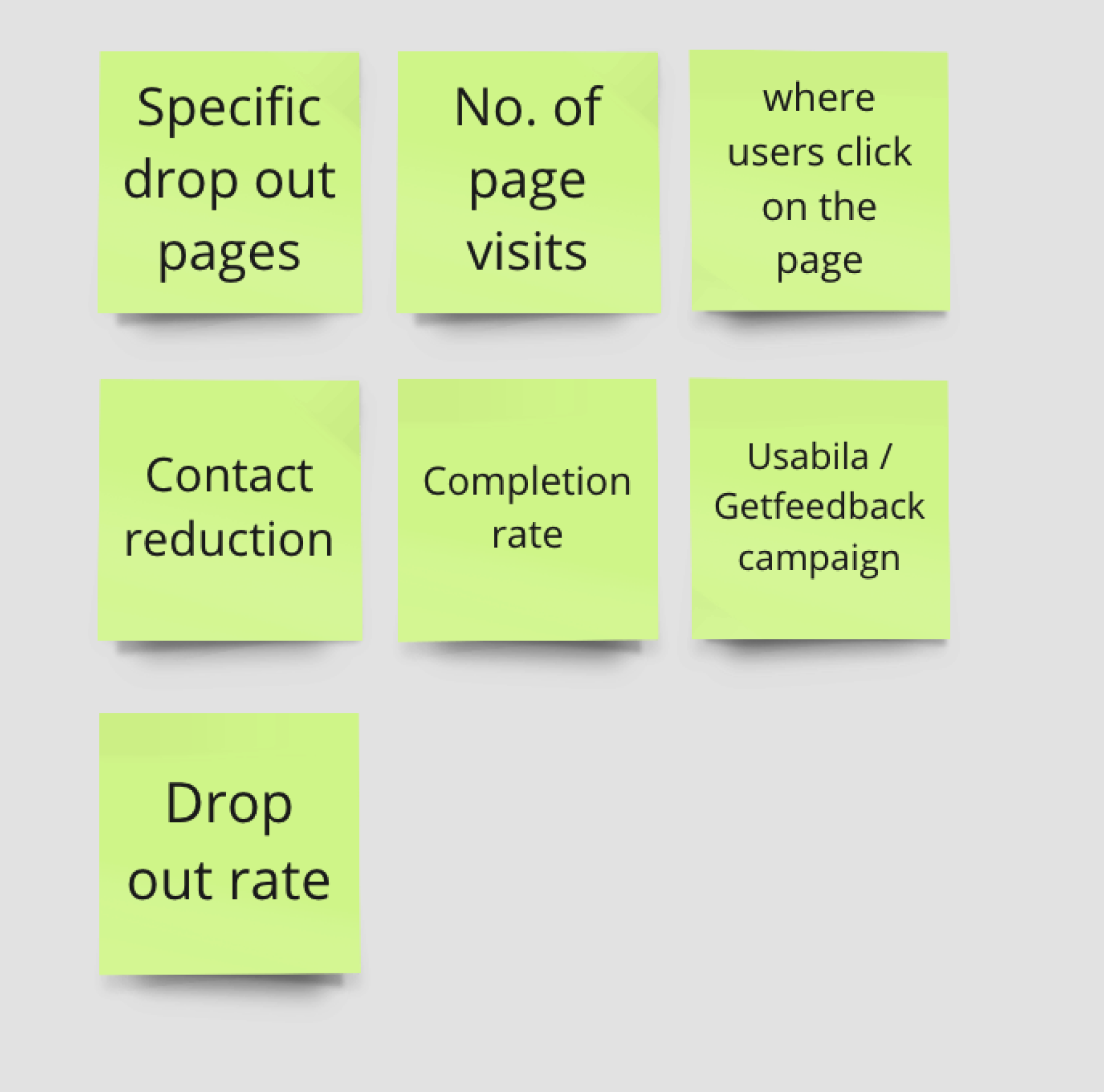
Getting together with a team of all professions to evaluate how we would measure the changes to the journey.
Takeaways
What I learned
- How to effectively work with developers to find a solution.
-
Where the user enters the journey from is very important
when iterating on a
user experience. - How to determine a problem vs. a solution.
What I’d do differently
- Further usability testing, to see if the copy and journey changes were interpreted correctly.
- Further research on FullStory to see how user interacted with the journey
